ABYSMAL FONT
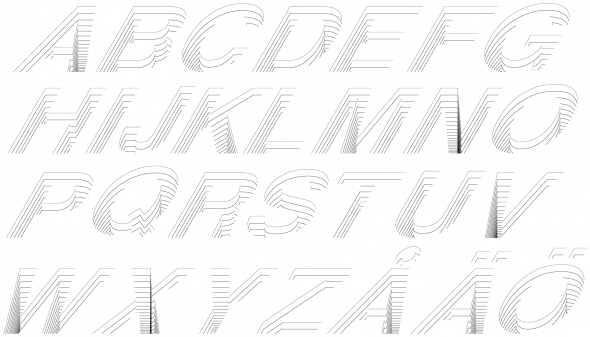
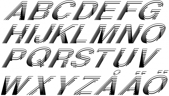
This is an idea I had for a font. The original letters are Helvetica treated with a vertical scale and a 30° shear to make them look more isometric. I had some help from a little script I wrote so much of it was an automated process but there was still a lot of manual tweaking to be done. I think some letters worked out better than others with this treatment so I guess I’ll try with another font that hopefully works better.
UPDATE (Oct 20)
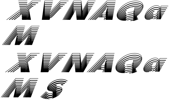
I changed the font to Futura Extra Black BT and at the same time I increased the line width which worked out pretty well.
 I think the thicker lines made all the difference so I reverted back to Helvetica and upped the width. Clearly better than the first version but I think I prefer Futura over Helvetica.


3 Responses to “ABYSMAL FONT”
December 5th, 2017 at 0:12
how do i download
July 26th, 2018 at 14:24
ok
November 27th, 2020 at 21:54
ok