AVERAGE FONT MAKES FOR AVERAGE REVIEW
Yesterday I so happened to come up with the idea of combining some fonts and with a low opacity find out what the average letter would look like. Granted, this would be a rather tedious task to, by hand; type, align and adjust opacity for each letter so I wrote a quick script in Scriptographer to automate the whole process. The result was kinda nice and writing something with an average font seemed like it would have some fundamental qualities to it. Well, apparently, not only was I wrong in that it was a novel idea, it is also considered “not worth writing about” according to Stephen Coles of Typographica.
Now, first off, I did get the feeling that this was a too simple an idea to not have been made earlier.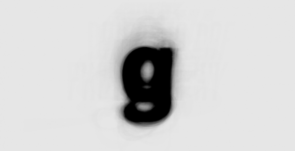 Rightly so, Moritz Resl did the same just a few weeks ago but I still have a lingering feeling that I’ve seen some sort of variant of this even further back.
Anyway, Stephen Coles - Editor of Typographica - was not impressed, he had this to say (full post here):
“It’s the sort of project that most designers have seen many times before they are even out of school.”
Perhaps it is, Stephen, but why come down so hard on it? Moritz didn’t, to my knowledge, make any claims to pioneer the font industry with this piece. Most likely he just got an idea and felt compelled to try it out.
Sometimes it seems that typographers are a group of over-zealous and pretentious people who have lost their ability to have fun and would rather be governed by their own strict rules. That’s what I like so much about FontStruct, the pure joy of having a creative outlet with no crippling rules as to how things should be.
On the plus side, Stephen did post two interesting links. One of them was to W. Bradford Paley, showing me another take on the average font.
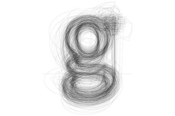
The other link was to Kai Bernau’s The Neutral Typeface. Kai has put a lot more effort into his font, well worth a look. Anyway, I should return to my own stuff. The script I made was very simple, I compiled a list of fonts to be used in a loop that cycles through a string of characters and prints the characters once for each font in the list.
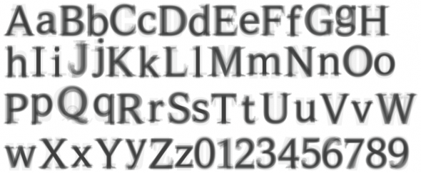 I can set the level of opacity as I wish, but with each letter being composed of 28 layers of different fonts somewhere between 5-15% seems to work best.
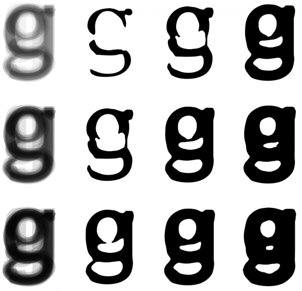
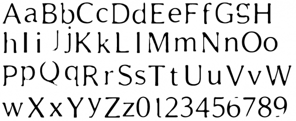
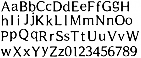
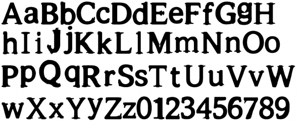
On each row a different opacity value have been used, the letters was then imported into Photoshop, blurred and finally a threshold adjustment layer was applied with three different values. In the result below, I used an opacity of 5%, pasted the chars into a high resolution (600dpi) Photoshop document, applied a 1px Gaussian Blur and three different (96, 128, 192) threshold levels.
3 Responses to “AVERAGE FONT MAKES FOR AVERAGE REVIEW”
November 23rd, 2011 at 0:31
Is there anyway that you could send me a ttf for the mid weight one, i think this is amazingly beautiful!!! I’m a second year design student and you may have just created my favourite sans serif.
November 23rd, 2011 at 10:54
Hi,
thank you for your kind words, much appreciated!
Unfortunately, these are not working fonts – well, not yet anyway. What you see here is just images made from my script. I haven’t had neither the time nor discipline to create the actual fonts. It was more of a proof of concept as there already seem to be a lot of this kind of type treatment around. If, however, I decide to make a working font out of it, I would gladly send it to you or post it here for download. I could, if you want, mail a high resolution copy of the image for you to have a go at it, creating your own font.
October 27th, 2013 at 20:21
hi, is the script still existing? would love to play around with it a bit.
thx
dan